
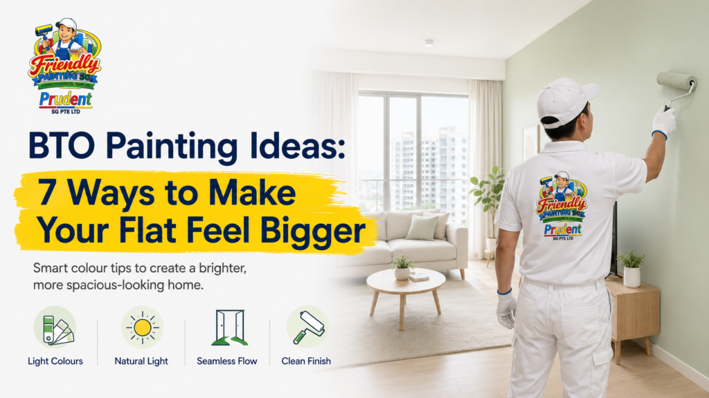
The best BTO painting ideas for making a new flat feel bigger are to use light or soft mid-tone colours as the main palette, keep adjoining spaces visually connected, paint the ceiling in a lighter tone, use cool colours strategically, limit strong feature walls, reduce harsh colour breaks around doors and trims, and choose colours according to the amount of natural light in each room. These techniques do not physically increase floor area, but they can make walls feel less visually enclosed and create a brighter, more continuous sense of space. Nippon Paint Singapore similarly notes that lighter tones can make small or narrow rooms feel more open and airy.
For a new HDB flat, good BTO painting is therefore not just about choosing your favourite colour from a catalogue. You need to consider room size, daylight, furniture, flooring, built-in carpentry, ceiling height, and how one space connects visually with another.
A practical HDB BTO painting plan should also start only after you have checked the walls and coordinated your renovation work. HDB advises new-flat owners to report defects requiring rectification, while renovation works remain subject to HDB’s applicable guidelines.
Friendly Painting Service (Friendly Painting SG) provides HDB painting across Singapore and currently lists site inspection, surface preparation, furniture and floor protection, masking, painting, final cleaning, and a one-year workmanship warranty among its service features.
This guide focuses specifically on one common BTO concern:
How can paint make a new flat feel more spacious without making every room plain white?
Quick Answer: Which Paint Colours Make a BTO Flat Feel Bigger?
For most compact BTO spaces, start with:
| Area | Colour Direction | Why It Can Work |
|---|---|---|
| Living room | Warm white, off-white, pale greige | Keeps the main space bright and flexible |
| Small bedroom | Pale blue, soft grey, light green | Creates a lighter visual feel |
| Dark bedroom | Warm off-white, light beige | Helps avoid a cold or dull appearance |
| Ceiling | White or lighter version of wall colour | Reduces visual heaviness overhead |
| Hallway | Same or similar colour as living room | Creates continuity |
| Feature wall | One controlled accent | Adds character without dividing every wall |
| Door/trim | Similar to wall or restrained contrast | Reduces unnecessary visual breaks |
However, light colour does not automatically mean pure white.
Pale greige, ivory, muted green, soft blue, light beige, and other gentle shades can still help a small space feel open. Nippon Paint notes that pale and mid-tones are useful when the goal is to maximise the sense of space, while lighter cool colours can also visually open a compact bedroom.
Why Paint Has Such a Big Visual Effect in a BTO Flat
In a smaller home, walls occupy a large portion of what your eyes see.
Consequently, strong colour boundaries can make you notice where one surface ends and another begins.
A more restrained palette can do the opposite.
When walls, doors, adjoining areas, and ceilings work together, the eye moves more continuously through the room. This can reduce the feeling that the space is divided into many small visual blocks.
At the same time, colour interacts with:
- Natural daylight
- Artificial lighting
- Flooring
- Furniture
- Curtains
- Built-in carpentry
- Reflections
- Room orientation
This is why a colour that looks bright in a showroom may look very different inside your actual BTO unit.
Nippon Paint itself warns that on-screen colour representations cannot guarantee an exact match and recommends checking physical colour references before final selection.
Therefore, test colours in the actual flat whenever possible.
1. Use a Light Main Colour Without Making the Whole BTO Pure White
The simplest of all BTO painting ideas is also one of the most effective: use a lighter main wall colour.
However, that does not mean your entire home has to become stark white.
You can consider:
- Warm white
- Off-white
- Ivory
- Pale greige
- Soft beige
- Misty grey
- Pale blue-grey
- Muted light green
Nippon Paint Singapore advises that lighter tones can help small or narrow bedrooms feel more open and airy.
Why Light Colours Can Help
Lighter walls generally reflect more available light than deep, dark surfaces.
As a result, corners are less visually heavy, particularly in rooms that already receive reasonable natural light.
However, your choice should still match the lighting.
A Bright Living Room
A naturally bright room may handle:
- Soft grey
- Muted green
- Greige
- Slightly deeper neutral shades
without immediately feeling closed in.
A Darker Bedroom
A room receiving limited daylight may work better with:
- Warm off-white
- Cream
- Light beige
- Soft warm grey
because excessively cool grey can sometimes feel flat when daylight is limited.
Do Not Select White Only Because It Is “Safe”
Pure white can work beautifully, but it can also feel clinical when:
- Lighting is very cool
- Flooring is grey
- Carpentry is white
- Furniture contains little warmth
Instead, choose the undertone deliberately.
If your floor is warm wood, an ivory or warm greige may create a more cohesive room than a very cold white.
2. Use One Continuous Colour Across Connected Spaces
One of the strongest BTO house painting strategies for visual spaciousness is reducing unnecessary colour changes.
Consider a typical layout where the:
entryway → living area → dining zone → hallway
can be seen from several positions.
If every zone uses a completely different colour, your eye registers multiple boundaries.
Instead, use:
- One main colour throughout, or
- Closely related shades within the same palette
This allows the connected spaces to feel like one larger environment.
Example
Instead of:
- Entry: grey
- Living room: beige
- Dining: green
- Hallway: white
consider:
- Entry: warm off-white
- Living: warm off-white
- Dining: same warm off-white
- Hallway: same or slightly lighter variation
Then add personality through:
- Furniture
- Artwork
- Rugs
- Lamps
- Curtains
- One controlled accent wall
rather than creating a new wall colour for every zone.
Why This Works Particularly Well in BTO Flats
Open living and dining layouts benefit from visual continuity.
The goal is not to remove all contrast. Rather, you want the eye to travel across the space before encountering a strong boundary.
This technique is particularly useful when the dining zone is small because it can feel like part of the larger living space rather than a separate box.
3. Paint the Ceiling Lighter Than the Walls
Do not forget the ceiling when planning your HDB BTO painting.
A ceiling occupies a large uninterrupted surface above the room. Therefore, its colour can affect how heavy or open the room feels.
For a straightforward spacious effect, use:
- Clean white
- Warm white
- A lighter version of the wall colour
If your wall is warm greige, for example, a warm white ceiling will usually create a softer relationship than an extremely blue-white ceiling.
Should the Ceiling Always Be White?
No.
Colour drenching—where the ceiling and walls use the same or closely related tones—can create an elegant effect.
However, if your primary goal is specifically to make a compact BTO room feel lighter and taller, a lighter ceiling remains the safer direction.
A Useful Trick for Low Visual Ceilings
Avoid an extremely sharp dark border at the top of the wall.
Instead, keep:
wall → cornice if present → ceiling
visually coordinated.
The transition should feel intentional rather than fragmented.
4. Use Cool Colours Strategically to Create Visual Depth
Cool colour families include:
- Blue
- Blue-grey
- Green
- Aqua
- Certain muted purples
Dulux Singapore notes that cooler colours can visually recede and help a room feel more spacious, while Nippon Paint notes that lighter blues, greens, and similar cool shades can help small rooms feel bigger.
However, cool does not mean dark navy everywhere.
For a compact BTO flat, consider softer options such as:
- Pale sage
- Muted eucalyptus
- Powder blue
- Light blue-grey
- Soft aqua
- Mist green
Where Cool Colours Work Particularly Well
Bedroom
Soft blue or muted green can create a calm visual background without overwhelming a compact bedroom.
Study Room
A light blue-grey can provide more personality than white while still keeping the room restrained.
Living Room
Muted sage or pale blue-grey can work when the flooring, sofa, and lighting complement the undertone.
End Wall of a Long Room
A carefully selected cool tone can create visual depth.
However, always test the actual shade in daylight and artificial light before committing.
5. Use Feature Walls Carefully—One Is Often Enough
Feature walls can look excellent in a BTO home.
The problem begins when every room has multiple competing feature walls.
Imagine:
- Dark blue TV wall
- Green dining wall
- Terracotta hallway
- Burgundy master bedroom
- Dark grey study
Each colour may look attractive independently.
Together, however, they can fragment a compact flat.
A better BTO painting strategy is to choose feature walls where they have a clear purpose.
Good Places for an Accent Wall
Consider:
- Behind the sofa
- Behind the bed
- TV wall
- Dining focal wall
- Study wall
Nippon Paint also recommends that, in compact Singapore spaces, a single bold accent can add personality while surrounding walls remain lighter and more neutral.
How Dark Should a Feature Wall Be?
There is no universal rule.
A feature wall can be:
- Deep blue
- Muted green
- Warm terracotta
- Charcoal
- Burgundy
- Dark beige
- Soft pastel
The correct intensity depends on:
- Room size
- Daylight
- Furniture
- Floor colour
- Adjacent walls
Use Furniture to Decide
If your sofa already has a strong colour, the wall behind it may not need another equally strong competing hue.
Likewise, if your headboard is dark timber, a softer wall may create greater balance.
6. Reduce Strong Colour Breaks Around Doors and Trims
This technique is often overlooked.
A small flat can contain many visible vertical lines:
- Doors
- Door frames
- Built-in carpentry
- Wall corners
- Skirting
- Hallway openings
When every item strongly contrasts with the walls, the eye notices each boundary.
For example:
pale wall + black door + white trim + dark cabinet
creates several immediate visual separations.
That may be exactly what you want in a dramatic interior. However, if the primary objective is spaciousness, more restrained transitions can work better.
Consider Painting Doors Closer to the Wall Colour
Possible approaches include:
White Wall + White Door
Simple and visually quiet.
Greige Wall + Similar Neutral Door
Creates a more integrated designer look.
Pale Wall + Slightly Deeper Door
Adds contrast without becoming dominant.
The same principle can apply to selected trims.
You do not need everything to disappear completely. Instead, decide which architectural elements deserve attention.
7. Choose Colours Based on the Natural Light in Each BTO Room
This is the most important idea on the list because there is no “perfect BTO colour” that looks identical in every unit.
Before choosing your paint, spend time inside the flat during the day.
Observe:
- Morning light
- Afternoon light
- Shaded rooms
- Bright windows
- Warm artificial lights
- Cool artificial lights
A colour is affected by all of these.
Test Large Samples
A tiny colour swatch can be misleading.
Instead, compare the colour on a larger area or use an appropriate physical colour sample.
Look at it:
- Morning
- Midday
- Evening
- With lights on
Nippon Paint also advises that screen colours are only approximations and that physical colour references should be consulted before making the final decision.
Why Lighting Matters for “Bigger” Effects
A pale grey that feels bright in a well-lit showroom may appear much darker in a bedroom with limited daylight.
Meanwhile, a warm off-white may come alive in that same room.
Therefore, the best BTO painting ideas are not simply colour names.
They are colour + light + furniture + flooring decisions.
Best BTO Painting Ideas by Room
Different rooms have different visual requirements.
Living Room
The living room is usually the largest shared visual area.
Good directions include:
- Warm white
- Ivory
- Pale greige
- Light beige
- Soft muted green
- Gentle blue-grey
If the living and dining spaces are connected, consider maintaining the same main colour.
Then use artwork or one feature wall for emphasis.
Small BTO Bedroom
For a compact bedroom, light and soft mid-tones are particularly useful when spaciousness is the goal. Nippon Paint specifically recommends pale and mid-tones for small or narrow bedrooms when the aim is to make the space feel more open.
Consider:
- Soft off-white
- Pale blue
- Light sage
- Warm grey
- Light beige
Avoid choosing an extremely pale colour solely for space if you actually want a cosy bedroom. A deeper colour can still be appropriate when atmosphere is more important than perceived size.
Master Bedroom
A master bedroom can support slightly richer colours because the goal is often both comfort and visual calm.
You might use:
Main walls: light neutral
Bed wall: slightly deeper complementary tone
Ceiling: warm white
This creates hierarchy without making the entire room dark.
BTO Study Room
Home offices often need enough visual character to avoid feeling sterile.
Good combinations can include:
- Warm white + muted green
- Off-white + blue-grey
- Pale greige + medium neutral feature wall
Keep large surfaces relatively restrained if the room also contains shelving, monitor screens, paperwork, or visual clutter.
Dining Area
If the dining area is part of the living space, using the same main colour can increase continuity.
Differentiate the dining area through:
- Pendant light
- Artwork
- Furniture
- Rug
- Wall decoration
rather than automatically changing the paint colour.
Should Every BTO Flat Use White Paint?
No.
White is popular because it is flexible and can support a brighter aesthetic, but it is not the only way to make a BTO flat feel bigger.
Consider the difference between:
Pure white
Clean and crisp but can feel cold under some lighting.
Warm white
Softer and often easier to pair with timber.
Greige
Balances grey and beige characteristics.
Soft sage
Adds personality while remaining restrained.
Pale blue-grey
Can create a cooler, airy feel.
The objective is not:
“Make everything white.”
It is:
“Avoid unnecessary visual heaviness while creating a coherent palette.”
Should You Paint Before or After Installing Carpentry?
Ideally, your painting sequence should be coordinated with the overall renovation schedule.
For example, wall work may need to account for:
- Electrical changes
- Air-conditioning work
- Carpentry
- Drilling
- Ceiling work
- Plaster repairs
- Feature-wall construction
Painting too early can lead to unnecessary touch-ups later.
On the other hand, certain areas may become harder to access after permanent carpentry installation.
Therefore, the contractor and renovation team should coordinate the sequence rather than treating painting as an isolated task.
HDB also advises flat owners to familiarise themselves with applicable renovation guidelines, since certain renovation works require specific conditions, approvals, or appropriate contractors.
Check Your New BTO Walls Before Painting
A new flat should still be inspected before decorative painting begins.
If you find a defect that should be rectified as part of your new-flat process, address it before covering the area with decorative work. HDB provides a process for owners to report defects requiring rectification in new flats.
For existing cracks, HDB also distinguishes between hairline cracks and wider cracks; its current guidance recommends suitable treatment for hairline cracks and contractor assessment for wider ones.
Therefore, before BTO house painting, inspect for:
- Visible cracks
- Uneven surfaces
- Holes
- Damaged corners
- Stains
- Moisture signs
- Areas affected by renovation work
The aim is to create a stable, even surface before finishing.
BTO Painting Mistakes That Can Make a Flat Feel Smaller
Using Too Many Strong Colours
Colour variety can add personality, but too many unrelated colours can visually divide the home.
Making Every Wall a Feature Wall
When everything competes for attention, nothing becomes a true focal point.
Ignoring the Ceiling
A visually heavy ceiling can change the feel of the entire room.
Choosing Colours Without Testing Them
Light conditions can dramatically influence perception.
Matching Paint Without Considering Flooring
The floor is one of the largest surfaces in the home. Wall colour should work with it.
Using Dark Colours Without a Plan
Dark colours are not inherently wrong for small spaces. In fact, they can produce attractive, cosy interiors. However, if your specific objective is maximum brightness and perceived openness, large areas of very dark paint may work against that goal.
Choosing Paint Before Carpentry Colours Are Confirmed
Walls, wardrobes, kitchen cabinets, TV units, and doors all exist in the same visual environment.
Plan them together.
A Simple Whole-Home Colour Formula for a New BTO
If you want a cohesive result without overthinking every room, try a 60–30–10-style visual approach as inspiration rather than a strict rule.
Main Background
Use one light or soft mid-tone throughout most common areas.
Secondary Colour
Introduce a slightly deeper complementary shade through selected walls, curtains, furniture, or carpentry.
Accent
Use a stronger colour sparingly through:
- Artwork
- Cushions
- Accessories
- One feature surface
This creates variety while preserving continuity.
For example:
Main: warm off-white
Secondary: muted sage
Accent: dark wood or charcoal
Or:
Main: pale greige
Secondary: dusty blue
Accent: warm tan
BTO Painting vs Full Interior Renovation: Keep the Intent Clear
If your main goal is to make the flat feel bigger, you may not need complicated architectural alterations.
Paint cannot change actual floor area. However, it can change how visually fragmented, bright, warm, cool, tall, or connected a room feels.
That makes painting a useful design tool when you want to influence perception without unnecessarily rebuilding the space.
However, painting should not be presented as a solution for:
- Structural problems
- Serious moisture issues
- Major wall defects
- Unapproved structural changes
If broader renovation work is planned, follow current HDB rules. HDB states that certain works—such as demolition or alteration of walls—require prior approval and are subject to renovation requirements.
Why Choose Friendly Painting Service for BTO Painting?
For homeowners planning BTO painting in Singapore, practical execution matters as much as colour selection.
Friendly Painting Service, operating online as Friendly Painting SG, currently provides HDB painting and other residential painting services across Singapore. Its website states that it has completed more than 5,000 projects, has more than 10 years of experience, and serves HDB, condo, landed, and commercial properties. These are company-published figures and should be considered alongside current customer feedback and your individual quotation.
The company’s current service packages list:
- Free site visit and quotation
- Surface preparation
- Furniture and floor protection
- Professional masking
- Paint options
- Labour and materials
- Final site cleaning
- One-year workmanship warranty
Its homepage also currently displays more than 110 verified Google reviews and includes recent HDB project examples.
For a new BTO flat, the useful approach is to discuss:
wall condition → room lighting → flooring/carpentry colours → preferred palette → required preparation → painting sequence
before finalising the job.
That creates a more project-specific result than choosing a colour only from a photograph.
Practical BTO Painting Checklist Before You Start
Before approving the final paint colours, check:
- Have new-flat defects been addressed where applicable?
- Are renovation works that could damage walls already completed?
- Is carpentry colour confirmed?
- Is flooring installed or at least selected?
- Have you seen the paint colour under actual room lighting?
- Which rooms need to feel visually larger?
- Where will feature walls go?
- Is the ceiling colour confirmed?
- Are doors and frames part of the painting scope?
- Does the quotation include necessary surface preparation?
- Are furniture and flooring protected?
- Who handles final touch-ups?
This checklist helps turn attractive ideas into a practical HDB BTO painting plan.
Final Thoughts: Which BTO Painting Ideas Work Best?
The most effective BTO painting ideas are usually the ones that create visual continuity rather than simply adding more colour.
If your main goal is to make your new flat feel bigger, start with these seven principles:
1. Use light or restrained main colours.
2. Continue related colours through connected spaces.
3. Keep ceilings visually light.
4. Use cool tones strategically for depth.
5. Limit strong feature walls to purposeful focal points.
6. Reduce unnecessary contrast around doors and trims.
7. Choose every colour according to the actual light in the room.
Most importantly, do not copy a colour scheme simply because it worked in another BTO.
Your flat has its own:
- Orientation
- Daylight
- Flooring
- Furniture
- Carpentry
- Layout
- Personal style
Therefore, a successful colour scheme should be tested in the actual space.
For homeowners who want help turning these ideas into an actual painting plan, Friendly Painting Service provides HDB painting across Singapore with site inspection, surface preparation, protective masking, painting, cleaning, and workmanship support included within its published service process.
The goal should not be to make your BTO look artificially large.
Instead, use colour intelligently so the home feels brighter, calmer, more connected, and comfortable for everyday living.
Frequently Asked Questions
1. What are the best BTO painting ideas to make a flat feel bigger?
Start with light or soft mid-tone wall colours, keep connected areas within one colour family, use a lighter ceiling, limit strong accent walls, and choose colours according to natural light. Nippon Paint Singapore notes that pale and mid-tones can help small rooms feel more open.
2. What colour makes a BTO flat look bigger?
Warm whites, off-whites, pale greige, light beige, soft blue, and muted light green can all work. There is no single best shade because flooring, sunlight, furniture, and artificial lighting affect how the colour appears.
3. Is white the best colour for BTO painting?
Not necessarily. White can create a bright look, but pale greige, ivory, beige, soft blue-grey, and muted green can also maintain an open feel while adding more character.
4. Can dark paint be used in a small BTO bedroom?
Yes. Dark colours can create a cosy or dramatic atmosphere. However, if the specific goal is maximum perceived openness, pale or mid-tone colours are generally easier to work with. Nippon Paint makes the same distinction between cocooning dark colours and lighter shades used to maximise spaciousness.
5. Should the living and dining areas use the same paint colour?
They do not have to, but using the same or closely related colours can create visual continuity, especially when both zones form one open space.
6. Are feature walls suitable for BTO flats?
Yes. A carefully chosen feature wall can add personality without overwhelming the room. For compact spaces, one purposeful accent is usually more cohesive than using several unrelated strong colours. Nippon Paint similarly recommends controlled accent use in compact Singapore interiors.
7. Should I inspect a new BTO flat before painting?
Yes. HDB provides a process for reporting defects in new flats that require rectification, so relevant issues should be identified before decorative work covers them.
8. When should BTO house painting be done during renovation?
The painting sequence should be coordinated with electrical, ceiling, carpentry, air-conditioning, and other renovation works to avoid unnecessary damage and repeated touch-ups. Applicable HDB renovation requirements should also be checked before renovation begins.
9. Does Friendly Painting Service provide HDB BTO painting?
Friendly Painting SG lists HDB painting among its main residential services and provides painting across Singapore. Its published process includes consultation, inspection, quotation, painting, and final inspection.
10. What is included in Friendly Painting Service’s painting work?
Its current website lists free site visits and quotations, surface preparation, furniture and floor protection, professional masking, labour and materials, final cleaning, and a one-year workmanship warranty among the inclusions of its painting packages. Exact scope should still be confirmed for the individual project.